
SaaS Website Design: 10 Examples That Go Beyond Inspiration
When you search about SaaS website design, tens of articles appear in different industry with different designs and purpose. But what the thought process is behind those designs is what matters the most for building a SaaS website that drive results.
A thought process tells you about strategy, how a specific decision was made, and it changed the result. When a website is designed there is a reason behind each and every detail, from a persuasive header to a visible CTA button its all is a part of the strategy.
If you are looking for your Saas website redesign, the example in this article are chosen because the before, the decision, and the outcome are all documented. For each one, you’ll see what lesson you can carry into your own site or brief. We’ll explore what goes after redesigns with a traceable decision and a reported result, including one that didn’t work as hoped, because that’s often the more useful lesson.
This article brings together six documented SaaS website redesign cases across subscription billing, developer tools, project management, video chat, and B2B cloud platforms, covering both Indian and global companies. Each example looks beyond the visual outcome to uncover the specific change made, the result it created, and the strategic lesson SaaS teams can apply to their own website redesign. You’ll also find a five-principle framework and a one-page brief template to help turn these insights into a clearer redesign direction.
Why Most SaaS Design Articles Fail You (And How to Read This One)
The website already listed top articles, so do not explain why it is like this and what impact it created That’s the gap this article tries to close. Most of what separates a good SaaS homepage from a forgettable one comes down to the role of UI/UX Design in boosting conversions, not the visual polish.
For every example below, ask the same three questions:
- What was broken and needed change.
- What specific decision addressed it?
- What changed as a result?
The reported outcome, and just as important, is what it tells you about the limits of that outcome. A few of the cases below moved one number without moving the one that actually mattered, and that’s worth knowing before you copy the tactic.
10 SaaS Website Redesigns - What Changed and Why It Worked
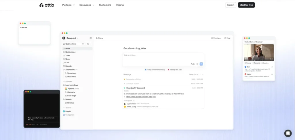
Attio’s homepage is built around a single idea that agents doing sales work while a human approves the outcome. Instead of describing this, the homepage literally shows it. There’s a live demo transcript running in the hero, an animated feed of an AI agent scoring leads and writing a follow-up email, and deal pipelines with real-looking company names moving through stages.
It’s dense, almost busy compared to typical SaaS minimalism, and that’s clearly deliberate a CRM’s whole pitch on the home page is “look how much this can hold and organize,” so a spare, quiet homepage would actually undercut the message.
What’s smart about this webpage is that the page doesn’t rely on only words and uses visuals to show. It runs a simulation of your actual workday in front of you before you’ve signed up for anything. There’s also a numbers section near the bottom that contains millions of API calls, tens of thousands of active agents dropped in without ceremony, functioning as proof of scale for a product that’s asking you to trust it with your entire sales pipeline.
The thought process here seems to be: for a category as crowded and skeptical as CRM (everyone’s been burned by one), the fastest way to earn trust isn’t a testimonial carousel. It’s showing the software actually working, unscripted-looking, in real time.
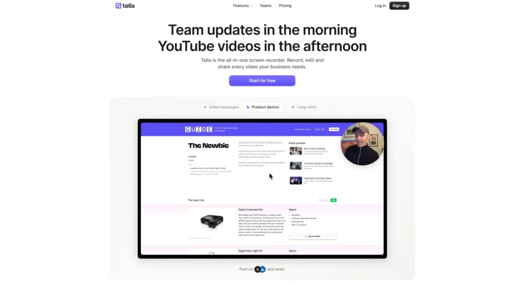
Tella sells screen recording software, and its homepage runs on the obvious logic that if you’re selling a video tool, the homepage itself should feel like a demo reel. The hero swaps between three video use cases: team updates, product demos, and current sitelong-form content, and drops you straight into what looks like a real recorded walkthrough, chapters and all, timestamps and reactions included.
Further down, the page does something a lot of tools skip and it shows its own analytics dashboard, with view counts, drop-off points, and CTA click rates on a sample video. That’s a specific decision; instead of just claiming “understand your audience,” it shows you the actual chart you’d be looking at a week after you started using it.
The FAQ section is worth noticing too. It directly answers “how is this different from Loom,” pricing, watermarks, and recording limits, in plain language, without any marketing spin. For a tool competing directly against a much bigger, more famous incumbent, answering the comparison question head-on rather than avoiding it is a confident design choice.
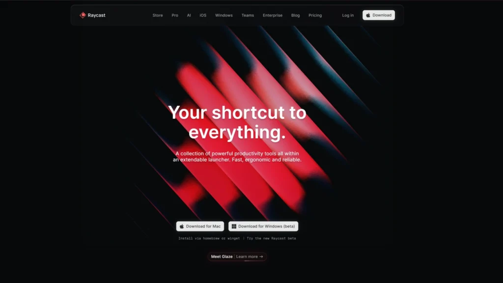
Raycast’s whole site reflects the same philosophy as the product depicts, speed as an aesthetic. The homepage headline is blunt Fast. Think in milliseconds, and the page backs that up with a stat that’s unusual to see on a SaaS homepage: a 99.8% crash-free rate, presented as a core selling point alongside speed rather than buried in a technical FAQ.
Visually, the site leans on real extension previews such as Linear issue search, Spotify controls, 1Password vault access shown exactly as they would appear inside the launcher, rather than illustrated mockups.
This is a deliberate choice for a developer-facing tool; developers tend to trust screenshots of the actual interface more than abstract marketing visuals since they can judge right away whether it looks like something they would use daily.
Moreover, since the product is keyboard-driven, the copy keeps reinforcing that identity: words like “native,” “keyboard first,” and “without leaving your keyboard” appear repeatedly. It is a small detail, however it does a lot of positioning work for a product that is fundamentally about never touching the mouse.
Granola’s homepage centers on one structural choice: showing the product in mid-use rather than describing it. The hero reportedly places raw, half-typed notes next to an AI-enhanced summary, letting visitors compare “before” and “after” in a single glance.
The key differentiator, that Granola doesn’t join meetings as a visible bot, is communicated through absence. There’s no bot icon, no “joining call” language anywhere. In a category where every competitor shows a bot avatar sitting in the call grid, leaving that out entirely is a quiet but effective way to signal difference.
The site also uses role-based landing pages, structured by function like sales, product, and engineering, rather than one generic homepage. Each reuses the same core screenshot of the notepad-plus-transcript layout, varying only the surrounding copy, an efficient way to serve multiple audiences without duplicating design work.
As Granola expands into team use, the navigation has added layers like shared spaces and folder permissions, without disrupting the simple layout anchoring the homepage. Holding onto that light, personal feel while the architecture underneath grows more complex is a useful pattern worth watching.
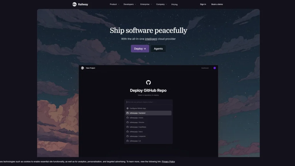
Railway’s positioning is built around removing the anxiety that comes with infrastructure tools, the sense that you’re one wrong setting away from a bill you didn’t expect or a deployment you don’t understand. The product runs on its own hardware across regions rather than reselling AWS or GCP capacity, and bills by the second based on actual usage rather than fixed instance sizes, which means an idle project costs close to nothing.
That’s a meaningfully different pitch from most cloud platforms, and it’s the kind of detail that matters enormously to the specific audience Railway is chasing solo developers and small teams who’ve been burned by surprise cloud bills before.
A pattern worth pausing on here: none of the ten examples above got their clarity by accident. Every one of them made a specific call about what to show, what to leave out, and how to say it, and that’s the same process a good creative partner runs a SaaS team through before a single wireframe gets built. Eilan Digital works through this kind of positioning and design thinking with SaaS and B2B teams across web development, UI/UX, and animation, so the reasoning behind the homepage is decided before the visuals are.
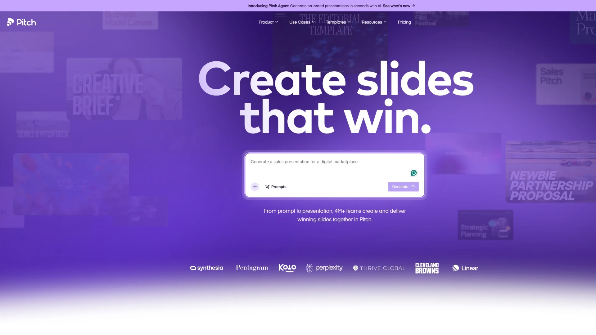
Pitch’s site sells presentation software by taking presentation design seriously as the actual product experience. The homepage leans on a specific, recurring claim “on average, users save over 5 hours every week” placed right alongside the visuals of the editor itself, tying the time-saving pitch directly to what you’re looking at.
What’s notable is how much of the page is about collaboration rather than individual editing: live co-editing, slide assignments, shared brand libraries, and templates that keep a whole team’s decks consistent. That’s a deliberate positioning choice against tools like Keynote or Google Slides, which are built around one person building a deck alone.
Pitch’s homepage keeps returning to “your whole team,” which tells you who they’ve decided their real competitor is, the scattered, inconsistent way teams currently share and edit decks across email and Slack. Putting this cleverly on the page poses an advantage in communicating benefits.
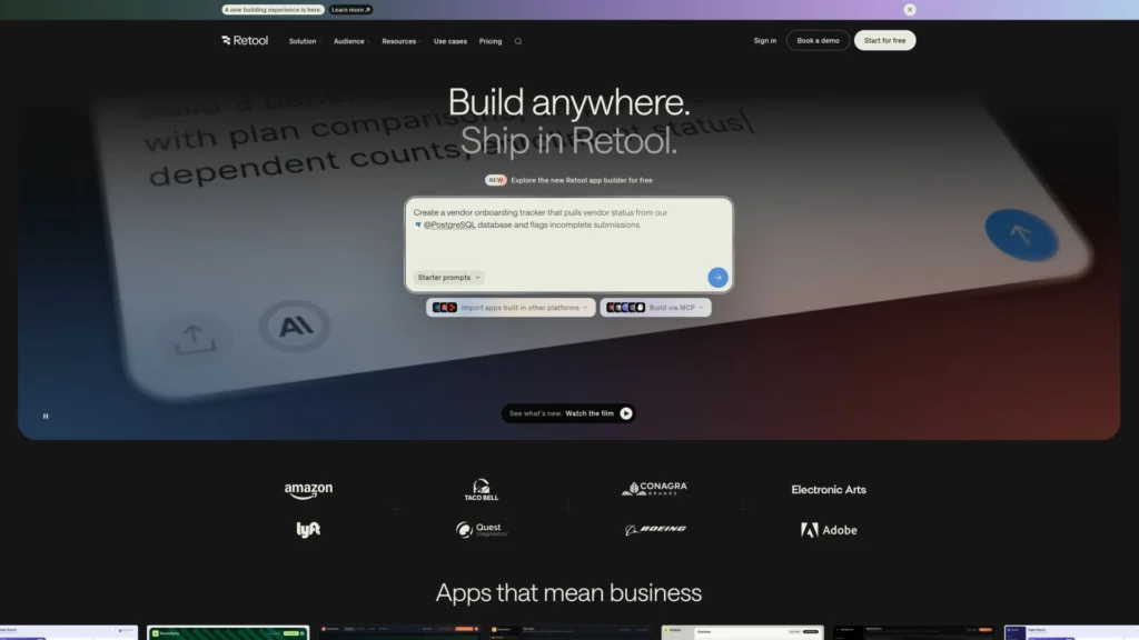
Retool’s site solves an unusual positioning problem it’s selling to developers, but developers who’d rather be doing anything other than building yet another internal admin panel. The copy leans into that directly describing internal tools’ work as unglamorous and pitching Retool as the way to stop rebuilding the same buttons, tables, and forms for the tenth time.
The homepage now leads with AI app generation, describing what you want in plain language and getting a production-ready internal app connected to your live data, which is a notable shift from Retool’s original drag-and-drop builder pitch.
That’s worth flagging as a real, current repositioning; the product used to sell “build internal tools faster with pre-made components,” and now sells “describe it and get a working app,” with the component builder as the layer underneath rather than the headline. For a company whose whole audience is developers, that’s a significant bet that even technical users increasingly want to skip the manual assembly step.
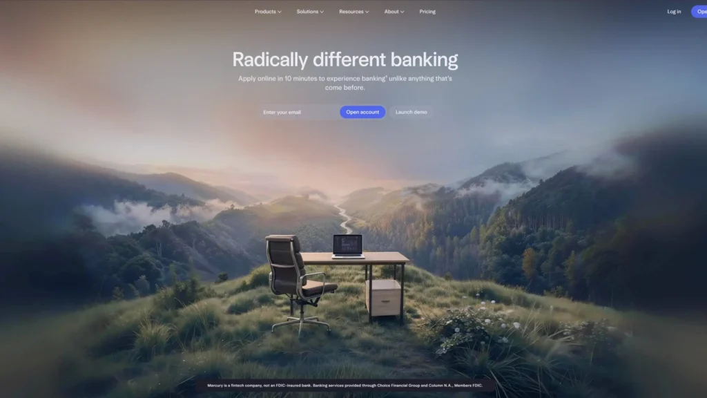
Mercury’s most interesting design decision is its labeling choice. The homepage leads with a live, interactive product demo. That reframes the whole decision: you’re not opening a bank account, you’re evaluating software, and software evaluation feels reversible and low-stakes in a way banking doesn’t.
The company is also explicit that it doesn’t consider itself a bank; it says so directly, positioning itself as a financial technology company that works with bank partners instead. That’s a specific, repeated distancing move from the categories (and baggage) of traditional business banking.
Visually, the site uses ample white space, restrained gradients, and a sticky navigation that keeps orientation steady as you scroll a calm, software-like presentation rather than the more traditional, security-badge-heavy design most financial sites lean on.
Worth noting that one design-focused write up pointed to the period after the Silicon Valley Bank collapse in March 2023, when a large number of businesses moved their banking to Mercury in a short window, as a real-world stress test of that trust-through-transparency approach people were making a banking decision under genuine financial pressure, and chose based partly on how much the product felt like something they could actually see and evaluate.
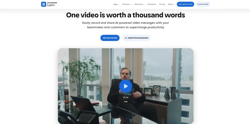
Loom’s site is built entirely around a single, recurring line of reasoning that most meetings could have been a short video instead. The homepage and supporting pages return to this constantly replacing a “can we hop on a call” message with a two-minute recorded walkthrough that the other person watches on their own schedule, comments on at a specific time stamp, and never has to calendar-block for.
The product’s positioning leans hard into “async video for work” as a category label Loom is trying to own outright, rather than describing itself simply as a screen recorder.
That’s a meaningful distinction; a screen recorder is a utility; “async video for work” is a claim about how teams should communicate, which is a much bigger and more defensible position if it sticks.
The site backs this with genuinely large numbers over 21 million users and 350,000 companies across 192 countries which functions less as a vanity stat and more as proof that the async-communication habit Loom is selling has already become mainstream, not a niche behavior visitors would need convincing to adopt.
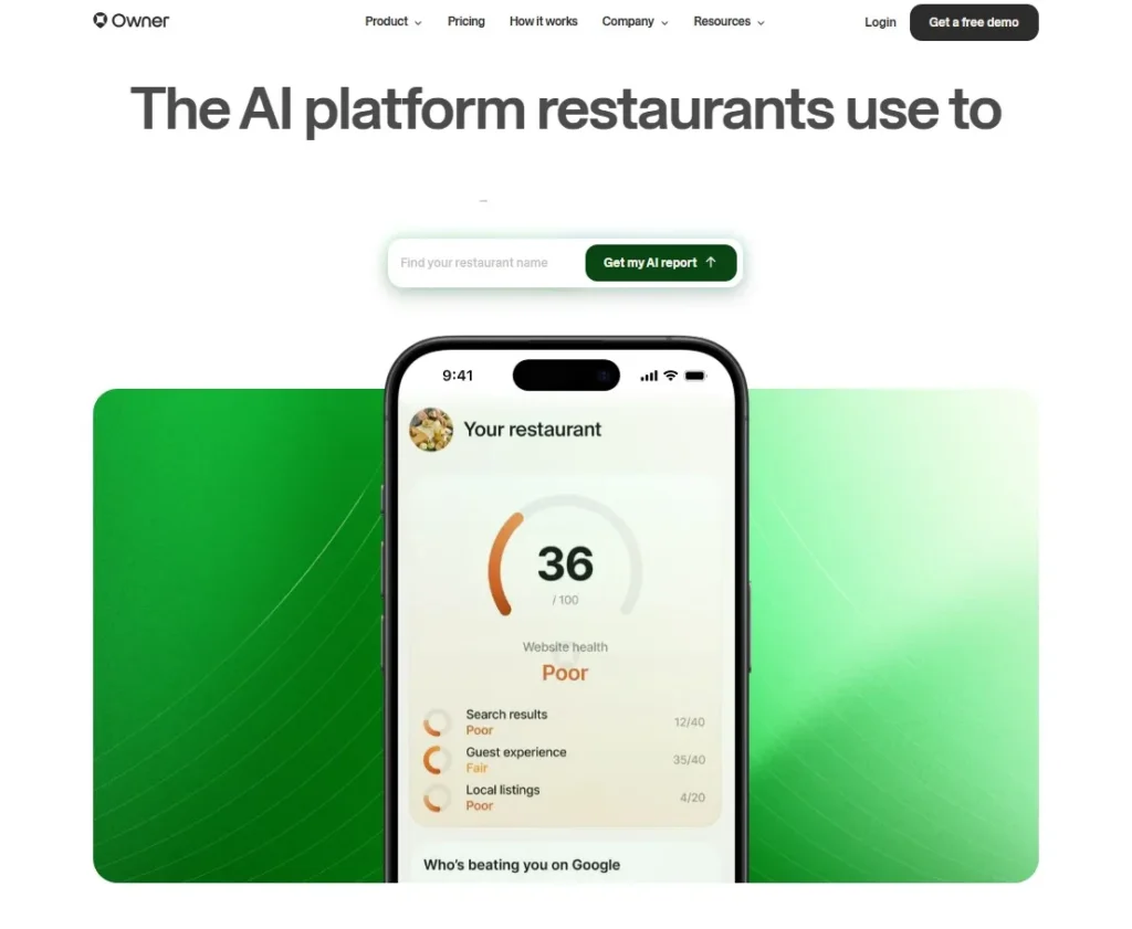
Owner’s site is the most openly unapologetic about a specific trade-off, and that’s what makes it worth including. The company states plainly that it limits design customization on purpose, and every restaurant using Owner gets a similar underlying template and structure because the product prioritizes conversion performance over visual individuality.
That’s a rare thing to see a SaaS company say about its own product out loud, since most website builders sell the opposite promise.
The homepage backs this constraint with a specific, sales-oriented case: driving direct online orders away from third-party delivery apps that take a cut of every sale, with restaurant-specific proof points like near $1 billion in cumulative sales driven and testimonials mentioning measurable order increases after switching from more generic builders.
The design decisions on the page heavy emphasis on ordering CTAs, menu visibility, and SEO positioning against delivery apps all point back to the same underlying thesis: for a small business owner without time to fuss over a website, a narrower, tested template that reliably converts is worth more than open-ended design freedom.
Taken together, these ten websites show that strong SaaS design is about making a clear product argument through every choice on the page.
The 5 Design Principles These Websites Prove
Principle 1 - Show the Product Working, Don't Just Describe It
- Attio’s homepage runs a live-looking demo transcript and an AI agent scoring leads in real time instead of a paragraph explaining what the CRM does.
- Tella’s hero is literally a recorded walkthrough with chapters and reactions because a screen recording tool’s homepage should look like the videos it helps you make.
- Raycast shows real extension screens, like Linear search and Spotify controls, exactly as they’d appear in the actual launcher, not as illustrated mockups.
- The lesson: a visitor believes what they see working far more than what they read about. If your product does something visual, put that thing on the homepage, not in a paragraph below it.
Principle 2 - What You Leave Out Can Be the Design Decision
- Granola’s biggest differentiator, not joining meetings as a visible bot, is shown by absence. There’s no bot icon anywhere on the page, which is itself the message in a category where every competitor shows one.
- Owner openly limits how much restaurants can customize their sites, choosing a tested template over design freedom because the product is built to sell orders.
- Mercury swaps the button “Open Account” for a live product demo, removing the language that triggers banking anxiety before a visitor even reads a word of copy.
- The lesson: sometimes the smartest design move is deciding what not to show, not adding one more section to explain it.
Principle 3 - Repeat Your Core Idea in the Copy, Not Just the Visuals
- Raycast repeats “keyboard first,” “native,” and “without leaving your keyboard” across the page, reinforcing the same interaction model again and again.
- Loom doesn’t call itself a screen recorder. It calls itself “async video for work,” trying to own a category label rather than describe a feature.
- The lesson here is that the words you repeat train the visitor on how to think about your product, so repetition of the right idea is a design choice, not lazy writing.
- This kind of disciplined repetition is one of several UX trends redefining enterprise platforms and SaaS products right now.
Principle 4 - Reframe the Buyer's Real Concern Before Pitching Features
- Mercury reframes “am I trusting my money to a bank” into “am I evaluating good software,” which lowers the visitor’s guard before any feature is mentioned.
- Retool shifted its whole homepage from “build internal tools faster with our components” to “describe what you want and get an app,” addressing developers’ real wish to skip manual assembly entirely.
- The lesson: buyers don’t convert because of a feature list. They convert when the page speaks to the actual hesitation in their head first.
Principle 5 - Let Real Numbers Support Trust Quietly
- Attio places usage numbers like millions of API calls and thousands of active agents near the bottom of the page, not shouted in the hero.
- Loom uses its user and company counts to show that async video is already a mainstream habit, not a new behavior visitors need convincing about.
- Owner mentions close to a billion dollars in restaurant sales driven, tying the number directly to the outcome restaurants care about.
- The lesson: numbers work best when placed near the claim they support.
What to Take Into Your Next SaaS Website Design Brief
The One-Page Brief Template
Before any wireframe starts, put these five things on one page:
- The problem with the current site: Which one page or element is clearly underperforming? What’s broken, what needs to change, and what outcome do you want instead?
- The primary buyer this redesign must serve: Who is the single most important visitor? If the answer is “everyone,” you don’t have a brief yet.
- The one action the homepage must drive: Trial, demo request, or signup. Pick one and make sure every section on the page should point back to it.
- Three reference examples from this article: Name the site, name the one principle you want to borrow from it, and name one thing you deliberately don’t want to copy.
- Your product’s one differentiating truth: What does your product do that no competitor does? The design has to communicate this clearly.
What to Ask Any Design Agency Before Signing
- Can you show me a SaaS site you designed, and explain exactly what changed and why?
- How do you specifically approach a homepage’s core message versus its visual polish?
- Do you handle UI animation and motion in-house, or through a separate vendor?
- Who owns the code, design files, and CMS access once the project ends?
- What does post-launch support look like, and for how long?
These questions matter whether you’re hiring a design studio or a full web development agency, since the wrong partner shows up fastest in the small print, not the pitch.
Conclusion
Most SaaS design articles show you a finished homepage and let you guess why it looks that way. This article tried to do the opposite: pull apart ten real, live sites and explain the actual reasoning behind specific choices so you can borrow the thinking, not just the look.
The five principles, in short shows the product working instead of describing it, decide what to leave out on purpose, repeat your core idea in your copy, speak to the buyer’s real hesitation before the feature list, and let real numbers do quiet, specific work instead of loud, generic work.
Next step: fill out the brief template above before your next redesign kicks off. Share it with Eilan Digital for a second pair of eyes, or browse the portfolio to see what this kind of thinking looks like applied, from a team that also handles the UI animation and motion work several of the sites above use to make their ideas land.
FAQs
Previous
Let’s talk about what
you’re building.
Whether you’re refining a brand, preparing a market launch,
or bringing clarity to a complex product, we help translate
intent into structured, effective execution.